
Apple Podcast Redesign
Introduction
Possessing a curious, information hungry mind, podcasts have been part of my daily routine since high school, and the Apple Podcasts app is what I have used since day 1. Though I am accustomed to the layout of the app at this point, I have always been frustrated by a multitude of UX design faults – browsing for new shows is confusing, searching for shows or episodes futile, general navigation unintuitive, and all in all the entire interface feels disorganization. And after every new iOS update I was consistently dumbfounded that the high level UX/UI designers at Apple never addressed these issues.
So I took it upon myself to redesign the app.
Design Process
1.) Competitive/Comparative Analysis: compare and contrast Apple Podcasts to its closest competitors
2.) Empathize: User Interviews
3.) Ideate: Brainstorm Ideas, Sketching
4.) Build: Prototype
5.) Test: Usability Testing, Final Ui Screens
6.) Reflections
Competitive/Comparative Analysis
Before doing any user research, I began by doing a competitive and comparative analysis of Apple Podcasts against its closest competitions to get some context. I looked up the most widely used podcast mediums and the top 3 were as follows: Spotify Podcasts – 26% of listeners, Apple Podcasts - 20% of listeners, and finally Google Podcasts – 16% of listeners. As these are the top performing apps, I decided to compare the Apples podcast app against Spotifys and Googles.


User Research
Eager to get started redesigning with my own list of grievances, I reminded myself that as a designer I am not the user and research was required to understand what the listening experience was like for others. I conducted 5 in person interviews (Ben, Robert, Satomi, Steven, Jannat), and here are some of their notable quotes:

Key Takeaways:
Ease of searching: People want to be able to quickly search for an episode.
Episode location: People want to be able to easily save and find specific episodes.
Barrier to entry: Know which episode in a new podcast they should listen to first.
Tailored browsing experience: People want to be able to quickly find shows related to ones they like.
Brainstorm Solutions

Redesign Solution
To address the 4 key takeaway listed above, I focused on 4 pages: Browse, Library, Show Page, and Listening page.
But before going any further, I want to point out 2 general redesigns:
1.) The first is the the tab bar at the bottom of the screen. On the original app the options shown are “Listen Now”, “Browse”, “Library”, and “Search”. The issue is, both the “Listen Now” category and “Browse” more or less seem to serve the function of discovering new podcasts. This redundancy is unnecessary, so I rid of the “Listen Now” tab and simply went with “Browse”.
2.) The listening element at the bottom of the screen has the options to play/pause and skip 30 seconds. I made a slight redesign where I kept both of those options but added a time elapsed bar at the top of it so the listener can see how far they’ve progressed in an episode.

Original

Redesign

Original

Redesign
Browse Page

Pain Points:
1.) There is excess white space that could be utilized to put more information on the page.
2.) The “Featured Show” section offers no information about the show that displayed. Listeners must first click the show, then read about it. If the goal is to attract listeners to these featured shows then there has to be more information up front; otherwise there are one too many interactions and the listener simply moves on.
3.) Although “New and Noteworthy” is a fine category for a browsing page, it would be preferable to have a custom tailored list of shows for the listener.
4.) Similar to number 3, the categories that are used (noted here as “Shows We Love”) are decent ones to have, but they should not come first. Listeners want a curated experience, not a general list that Apple decides applies to everybody.

Redesign Solution:
Improved UI: My redesigns UI brings attention towards the parts of the page that matter the most. The “Featured Shows” colors are prominent and “Categories” are picture themed.
1.) Improved “Featured Shows”: By utilizing the wasted white space, I was able to include a short description of the featured show. This grabs the attention of the listener which plays two key roles. 1.) Gives the listener enough information to quickly know if they are interested in the show and 2.) increases traffic towards that featured show.
2.) Addition of “Categories” scroll: when I asked my interviewees how they tend to browse for new media (e.g shows on Netflix, music on Spotify), an overwhelming number of them told me they go through the “Categories”. This was a simple enough change, so I placed a horizontal scroll of categories front and center.
3.) Addition of “Recommended”: Adding this is a no brainer. Having this category before any other gives listeners a curated list of shows that they will likely enjoy. Other show lists (such as “New and Noteworthy”) would be best saved for lower down on the screen.
4.) Addition of “Fresh Ideas”: This is probably my favorite addition to this page. The idea came about when talking to my interviewee Ben; we got off topic and discussed how podcasts are, for so many people, an echo chamber. It’s easy to only listen to ideas that you agree with, and given that this is a social issue that bothers me deeply, and because much of our current mediums for getting information supports these habits, I decided that my redesign will include a section where the shows recommended are curated to challenge your listening norms.
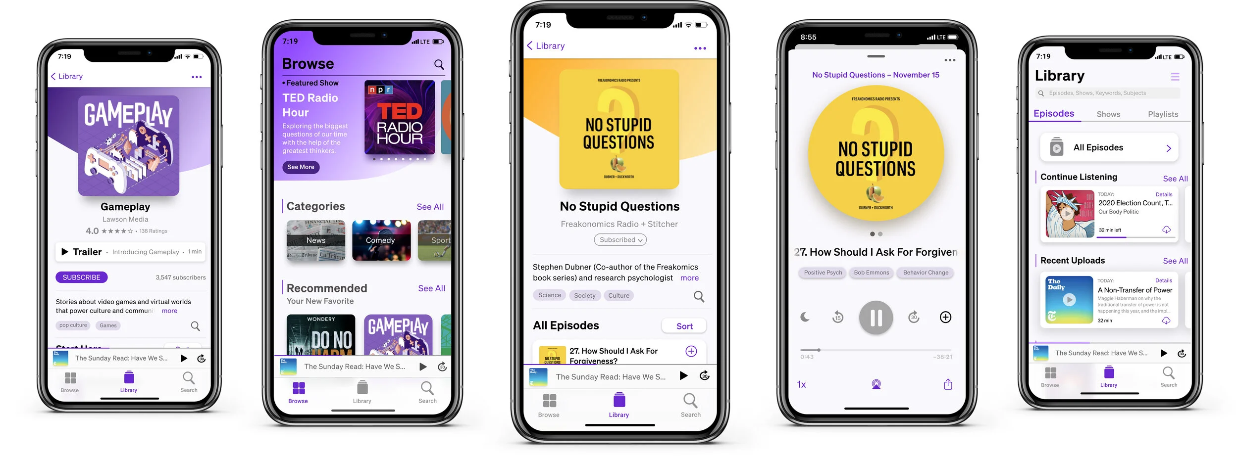
Library Page
The Library portion of this redesign consists of many parts, so I will break it down into 3 parts: the Libraries “Episodes”, “Shows”, and my newly created “Playlists” sections.
Library: Episodes

Pain Points:
Page #1
No Search: Inability to search for a specific episode or show!
Limited modes of navigating library selection: A navigation selection of “Shows”, “Episodes” and “Downloaded Episodes” is not nearly enough to quickly find a specific show/episode. In fact, this is a pain point I deal with constantly. I find myself scrolling endlessly to find a podcast I either listened to in the past or was listening to and want to continue.
“Recently Updated” shows list isn’t specific enough: It only tells you which shows have been updated recently, but what actually matters is what episodes have been recently uploaded. It’s too general. People listen to episodes, not shows.
Page #2
Sorting limitations: When a listener is on the episodes list page and clicks sort, they can only sort by title or date of upload. That’s it! It feels disorganized and thoughtless.

Redesigns:
1.) Ability To Search: There is now a search bar where you can search for any show, episode, or keyword within Library.
2.) Toggle Bar: I eliminated the 3 descending buttons of “Shows”, “Episodes”, and “Downloaded Episodes” and used a toggle bar with “Episodes”, “Shows”, and “Playlists” instead. This frees up space on the page to include more useful interactions.
3.) Inclusion of “All Episodes” Button. This essentially acts like the “Episodes” button on the current Library Page design as the option to see everything at once is still important.
4.) Organization of Episodes: I organized the episodes into 4 categories:
“Continue Listening”: Quickly resume an episode
“Recent Uploads”: Ability to see what episodes have been recently uploaded
“Downloaded”: This is taken from the original design. This is an important inclusion because if a listener has limited or no cellular data, you can scroll through these episodes)
“Listen History”: If the listener forgets to add an episode to a playlist, you can still scroll through your entire listening history to find it.
Library: Shows
Current Designs Pain Points:
Shows organized in alphabetical order: Organizing the shows in this fashion does not reflect the listeners needs to quickly find the show of their choice. If their favorite show starts with the letter Z then they would need to scroll to the bottom of the page to find it.
Cannot tell which shows have had recent uploads: Listeners want to know when their favorite show has been updated, but this current design does not offer that information. This is a missed opportunity for both the listener and the podcaster – the listener will be unaware of any new updates in turn causing the podcaster to see less traffic.

Redesign Solutions:
Change Chronology: Instead of listing the shows in alphabetical order, the shows are now listed from most to least often listened to. This allows the listener to quickly access the shows they often frequent.
Addition of “New Uploads” Marker: By adding a clearly visible red “New Marker” symbol, it informs the listener that their favorite shows have been updated. This encourages the listener to keep updated as well as giving the podcaster a better chance for increased traffic

Library: Playlists
A major pain point with the Apple Podcasts app is the inability to easily save or find episodes that you’ve already listened to. There is an option to save an episode in the current design, but when I asked my interviewees if they use that feature not a single one did. Why? Because they had no idea where to find those episodes that they saved! In fact, I had to Google how to find those saved episodes. In short, that is very unthoughtful UX.
So my solution? Playlists! Playlists not only let you save episodes, but it allows you to organize and categorize them. It’s a common thing with music apps, so why not for a podcast app?

Show Overview Page
As the app currently stands, the show overview page has little information and hardly any useful interactions. To address all the pain points I encountered in my research and personally, I will show two redesigns.
The first redesign is of the show overview page of an already subscribed podcast.
The seconds redesign is of the show overview page of a new show that has not been subscribed to yet.
Subscribed Show Page
Pain Points
Cannot search for a specific episode: If you want to find a particular episode within this overview page, it is impossible to do so as there is no search option.
Difficult to figure out how to unsubscribe: Intuitively there should be an option that easily lets you unsubscribe from a show on an overview page, but there is not. As a result unsubscribing is a confusing process.
No information about the show: There is no place that informs the reader about some essential information about the show (e.g who the hosts are, the basic themes).
Cannot sort episode in a customized order: what if a listener wants to start with the oldest episode then work their way forwards or show only downloaded episodes? There is no way to sort the episodes to do so.


Redesign Solution
Improved UI: The most noticeable change are the aesthetics. The original looked 2 dimensional and did not highlight anything about the show itself, simply listed episodes. In this redesign I brought the show cover front and center and made the entire pages color scheme to match the shows.
1.) “Subscribed” Button: This allows the listener to quickly hit this button which will reveal an option to unsubscribe.
2.) Information about show: This is helpful as the podcaster can add any important information (e.g the hosts names, show website, sponsors, etc.)
3.) Subject Search: Each show belongs within subject categories, so these subject buttons highlight that and allows the listener to click and find more podcasts with the similar themes.
4.) Search Option: This is a simple inclusion, but a seriously helpful one. No more scrolling through an endless list of podcasts to find an episode from 2016. Simply type it in.
5.) Sort Option: Like the Search Button, this Sort Button is a simple solution that allows the listener to order the episodes in any way they like. A bit of a UX no brainer.
6.) + Button: Allows to add the episode to a playlist.
Unsubscribed Show Page
Pain Points
Barrier To Entry: A common complaint I got in my interviews was how it is difficult to start listening to a new show because they don’t know which episode they should start with. Often, they would listen to a random episode only to be disappointed and give up on the show. Only if they could listen to the best episodes first!
No Social Context – people use social context to make decisions about if something is worth listening to.


Redesign Solution
1.) Start Here Section: The podcaster can place what they believe to be their top 2 or 3 episodes so it gives the listener the best chance to hear the best the show has to offer from the get-go.
2.) # Subscribers: Offers an easy gauge of how popular a show is. This in turn lets the listener know if it is likely a good show.
Listening Page
Pain Points:
Difficult to find sleep timer: To find it, you must scroll down. Nobody I interviewed knew this to be a feature.
No information about the episode: Many listeners want an inside look into the episode: what does the guest look like? Are there links that are important/related to this episode? Etc.
Cannot browse related episodes: My interviewees talked about how when they find an episode they love, they want to find other episodes (from any show) related to it. But there is no way to easily do this with this current design.


Redesign Solution
1.) Subject Buttons: These consist of notable themes, topics, guests, etc. The listener can then click it and be taken to a page where there are episodes and shows related to the keyword. See “Positive Psychology” example above.
2.) Clearly visible sleep timer
3.) Replace volume bar with time elapsed bar: Hardly anybody takes the time to unlock their phone and use the volume bar on screen to adjust the volume. By eliminating it that space can be utilized for more useful features.
4.) X Ray: The podcaster can place any appropriate information relating to the episode. This gives the reader easy access to links, information about guests, or any other important information.
5.) Share Button: My interviewees often share episodes with others, so the ability to do so should be front and center.
Final UI Screens

Usability Testing/Reflections
Usability Testing:
At the end of the project, I asked my 5 interviewees to test the final high fidelity prototype. I asked them 4 questions:
1.) Do you believe the UI is improved?
2.) Is the redesign more intuitive to navigate than the original?
3.) Does the redesign offer you features that improve your listening experience?
4.) What does the overall experience feel like?
The Results
5/5 participant reported drastically improved UI
5/5 participants reported that the redesign was more intuitive in it navigation
5/5 participants reported features that greatly improved listening experience
All participants reported a smooth and easy experience
Reflections
First off, thank you so much for reading through until the end. Creating this was a multi-week process, but ultimately, I’m very proud of the result.
Given that this was a redesign, this project in particular refined a multitude of skills I believe to be indispensable as a designer. For instance, an effective designer requires a sharp eye for identifying what could be better, not necessarily what is acutely wrong. The Apple Podcast app is a perfect example as it is so widely used most listeners have adapted to its interface, not seeing anything specifically wrong with it – a successful designer can’t stop at “it works”, they have to see one step ahead to what could be better.
In retrospect, there is one main thing I would do differently if I were to redo this project: I would have some redesign ideas written out before my interviews. Doing so would help me direct interview questions in more specific ways as I would have already thought of my own grievances – for instance, formatting a few questions around “do you also find that X as an issues”. This is not in an effort to bring my own biases into the interview, but to encourage the interviewee to think critically about (as explained in the previous paragraph) what could be improved that they haven’t thought of yet.