Introduction
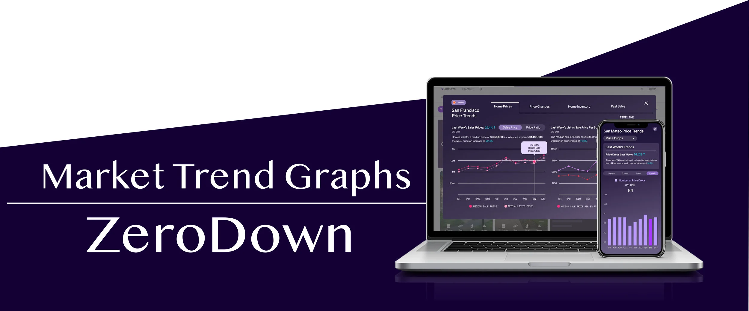
As a Product Designer at ZeroDown (a Bay Area startup that offers home purchases with zero down payment), I aided in producing designs to improve their existing website as well as spearheading multiple projects for the websites mobile UI/UX. The project described here aimed to take a large quantity of housing market data and translate that information into concise and comprehensible graphs for both web and mobile. I describe the creation process below.
The Challenge
Defining The Challenge
Housing market data consists of large quantities of statistical points. When going into detail it is easy for some of these to become esoteric values that are foreign to the average prospective home buyer. The challenge I was tasked with was to take all these points and create graphs that were visually appealing and psychologically intuitive.
Here is the list of housing market data points I was given to work with:
Number of Homes Sold
Number of New Listings
Median Sale Price
Sale To List Price Ratio
Sale Price Per sqft
List Price Per sqft
Number of Homes with Price Drops
Percentage Homes Sold Over List Price
Total Homes For Sale
Median Days on Market
The list of statistical points was exhaustive. So even before starting the creation process I discussed with the heads of ZeroDown and we agreed that it may be best to eliminate some data; but before elimination I was asked to prototype everything, prioritization would come later.
Brainstorm/Ideate
Brainstorming Possible Solutions
Sketch
Here are two rough sketches of both the web and mobile design:
Build
Final Prototype
I will only show a few examples of the total number of graphs made. Both the UI and UX for all the graphs are identical to the ones shown below, the only thing different is the data.
Web Format
The Design
Graph Explanation: The first piece of information gives the percentage change between two temporal conditions – this single percentage value is enough information for many. Next, there is a fleshed out sentence explanation of the significance of that data. This is helpful in that many users will not understand the arcane nature of statistics, therefore a concise and comprehensible sentence explanation is clarifying.
Data Categories: I took all the data and instead of putting them on different tabs I placed them under certain categories. This minimizes tabulation, organizes the information, and overall makes the navigation experience much more intuitive.
Hover State: Hover over any data point and the box will appear above to tell you its exact value
2 data sets per graph: Since many of the data sets are comparisons to one another (in this case Sale vs. List Price), instead of making separate graphs for each I stacked them. This saves space but more importantly gives the viewer comparison points to give the data context.
Mobile Format
This project was done as a mobile first design, and due to the constraints of presenting complex data on a mobile screen (especially as a modal), the mobile and web formats clearly have different UI. I discussed this with the development team, and we agreed that as long as I used components from the ZeroDown component library, it wouldn’t be too difficult to implement both designs.
Non-categorical Tabulation: In the web format graphs were categorized based on data similarities, but on the mobile version I stuck with keeping each data set separate as there was no way to fit enough graphs without scroll (it is best to avoid horizontal scroll in a modal).
Price Point Comparison Card: This simple card gives data on percentage change between two temporal conditions. Because I took a mobile first approach to this project, like in the web format, there is a sentence explaining the significance of the price changes.
Data Point Pressed State: When the user presses on any point of data, the date and value of the that point will be clearly stated above the graph.
Single Set of Data: On the web format two data sets were placed on the same graph, but on the mobile stacked data points is not ergonomically possible (if two points are stacked closely to each other, the finger pad is not a fine enough tip to differentiate one versus the other). Therefore, I placed a toggle at the bottom of the graph that acts as both an axis label and a toggle between two set of data (Sale vs. List Price).
Reflections
Reflections
After presenting the prototypes to the ZeroDown team we discussed which graphs were most important to keep. We decided to eliminate “Sale To List Price Ratio, “Sale/List Price Per sqft”, and “Percentage of “Homes Sold Over List Price.” The developer team is currently working on implementing these designs.
This project was a perfect practice in taking arcane information and making it palatable. To be able to make complex data sets like those described above, and present it in a fashion where even the most mathematically un-inclined will be able to comprehend it is a skill every effective Product Designer must possess. And I believe the end product presented here accomplished that task.


